Too much friction to start
Existing tools required setup, learning, and decisions before students could add the first task.
Noty · AI task management
A little support for everything on your mind.

Project at a glance · AI-Assisted Task Management
A lightweight task-management experience that helps students capture tasks quickly, adapt their day, and use AI to turn large projects into doable steps.
Overview
Students were already managing tasks across notebooks, calendars, reminders, apps, and memory. The problem was not a lack of tools—it was the effort required to keep those tools useful.
Noty brings fast capture, a today-focused plan, and AI-assisted project breakdown into one lightweight system designed to feel supportive rather than demanding.
My contribution
I contributed throughout the project and took a leading role in shaping the mobile interaction experience during the design phase.
As a team, we conducted research, synthesized findings, defined the shared feature set, and explored how the experience should adapt across platforms.
I translated those decisions into detailed mobile flows and prototypes, proposed drag-and-drop rescheduling, and focused on defining AI's role without removing user control.
Research
We asked them
We looked beyond feature preferences to understand habits, abandonment, and the emotional experience of getting work done.
Which tools do you use?
How do you manage tasks today?
What makes you stop using a tool?
What keeps you motivated?
Existing tools required setup, learning, and decisions before students could add the first task.
Students had to remember to open the app, so important tasks disappeared until deadlines felt urgent.
Digital completion lacked the visible, satisfying sense of crossing something off on paper.
Strategy / How Might We
Record a task before the thought disappears.
Keep today visible and make changes easy.
Make progress tangible and satisfying.
Help users adjust without framing unfinished work as failure.
Key features
Low-fidelity / Interaction exploration
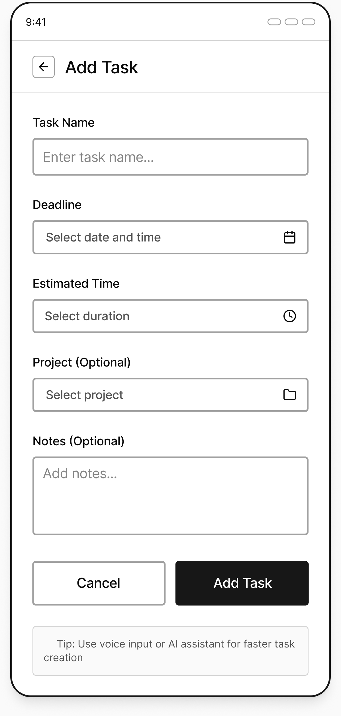
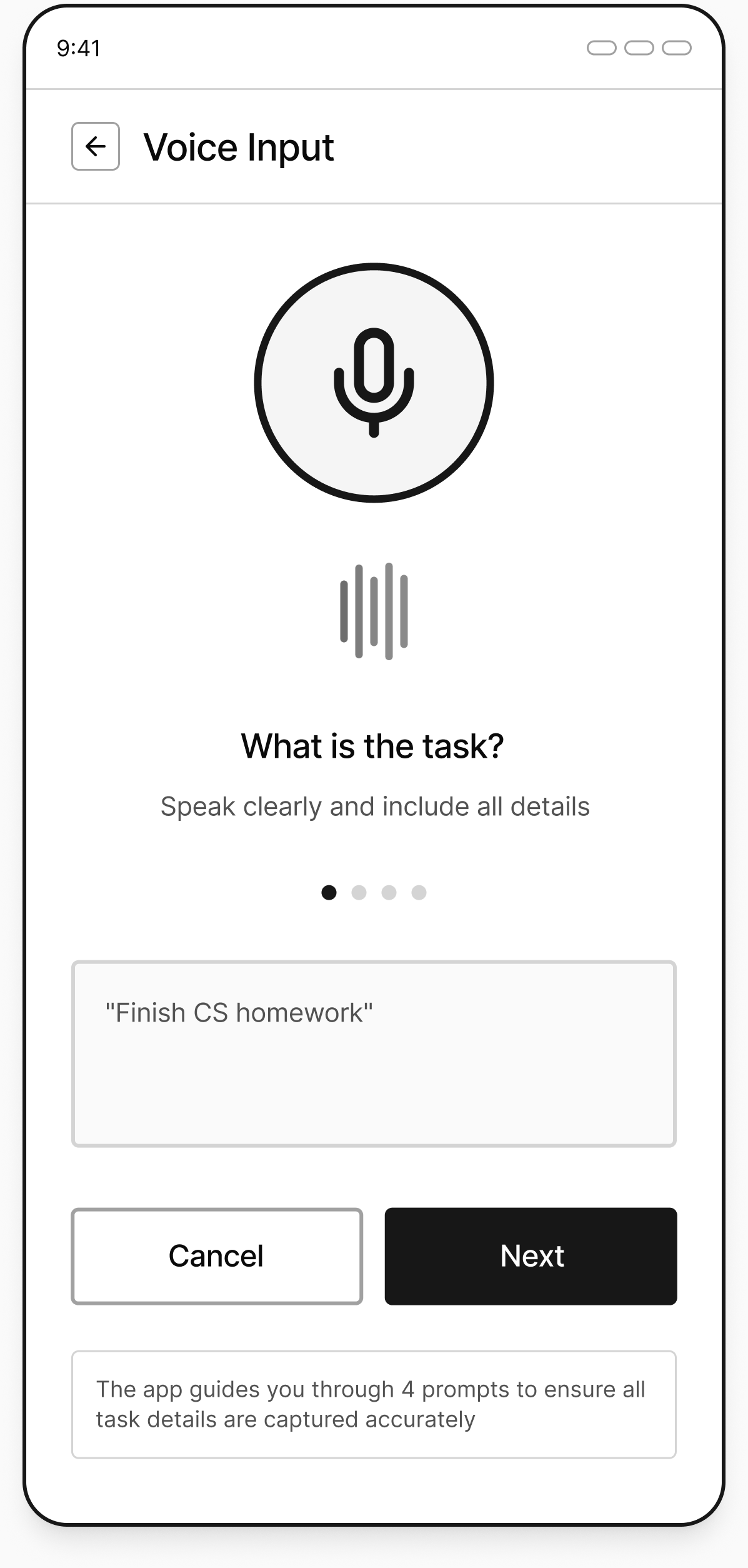
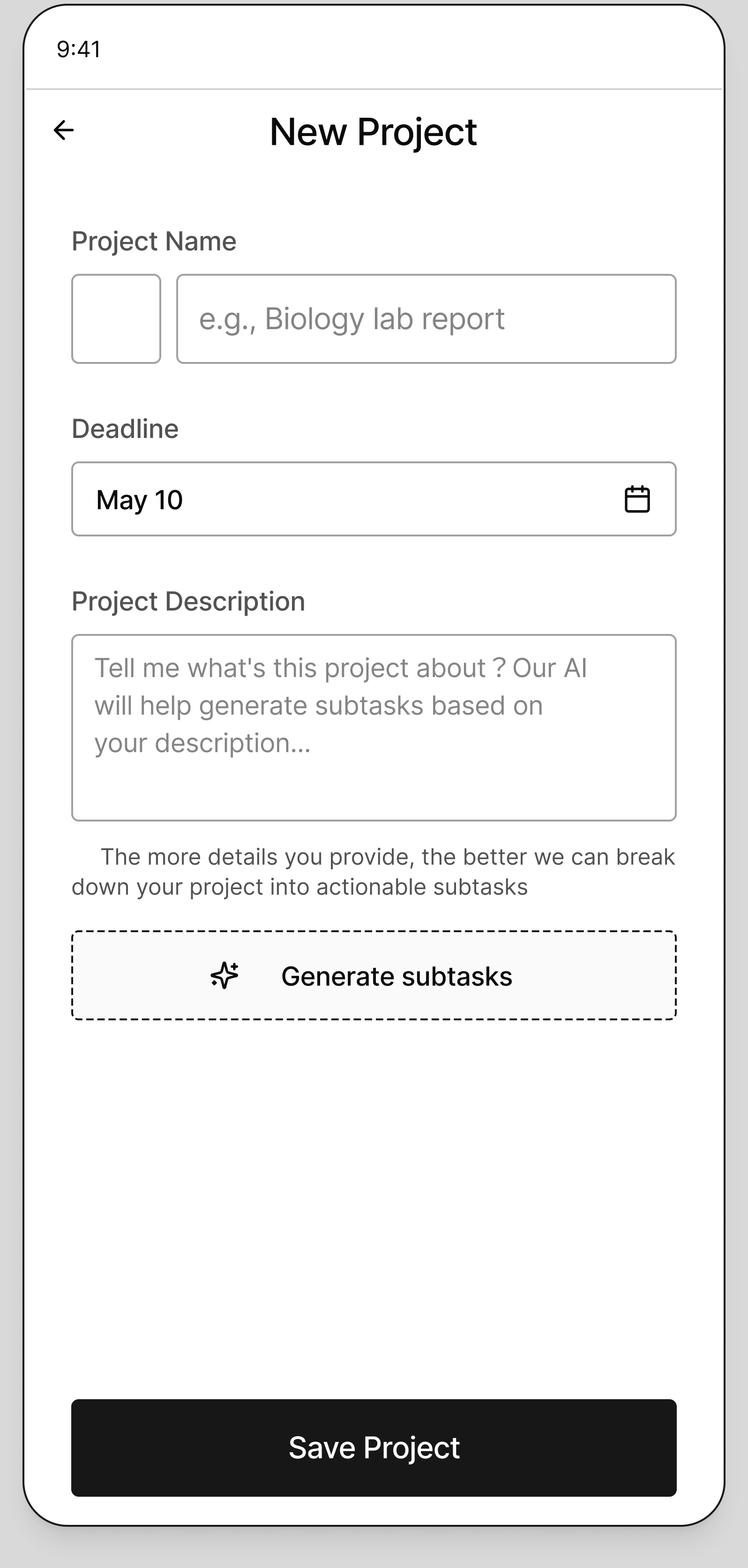
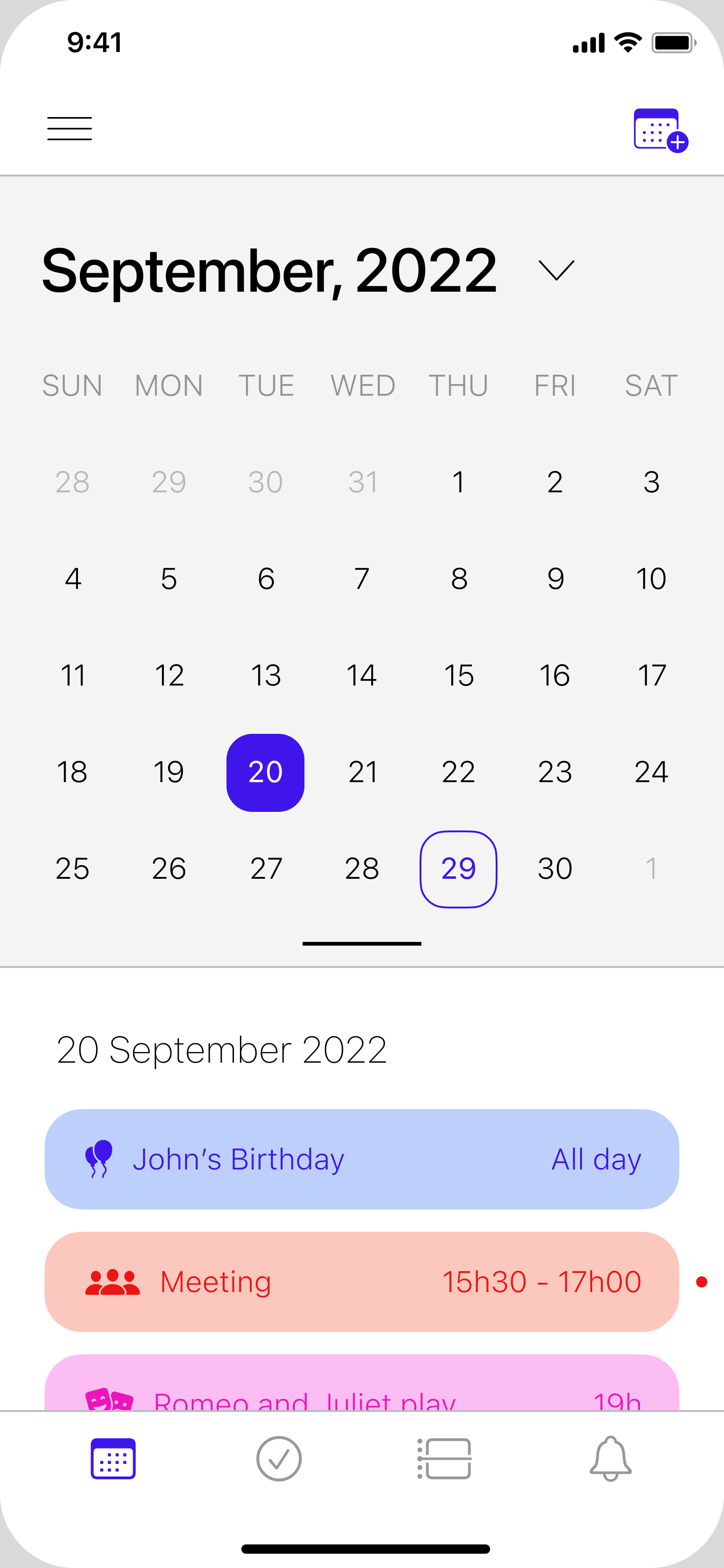
Across 60+ sketches and wireframes for three formats, we explored how students would enter tasks, review dates, move between daily work and projects, and respond to AI suggestions. I focused on connecting these decisions into the mobile interaction flows.
These wireframes made the interactions available for usability testing. The findings and resulting changes are shown in Testing & Iteration below.
Core flows
Students moved between paper, calendars, notes, and memory. The longer the setup, the more likely a task was lost.
Support manual, voice, and photo input across the mobile app, widget, and desktop shortcut.
A user can capture first and organize later, without committing to one planning habit.
Students wanted to reschedule directly from the to-do view when a plan changed.
Keep the interface centered on Today and use drag-and-drop to move unfinished work to another day.
Rescheduling becomes a direct manipulation instead of another form to complete.
Large projects felt vague, oversized, and difficult to begin.
Use AI to suggest subtasks, while letting users accept, reject, edit, or add their own steps before saving.
AI reduces blank-page pressure without deciding the plan for the user.
AI principle
AI proposes.
The user decides.
Interactive prototype
Explore how Noty helps you capture a task, break down a project, and adjust your day.
Open prototype (opens in a new tab)
Testing & iteration
Test tasks
User testing · Round 01
User testing · Round 02
Finding → change
Before
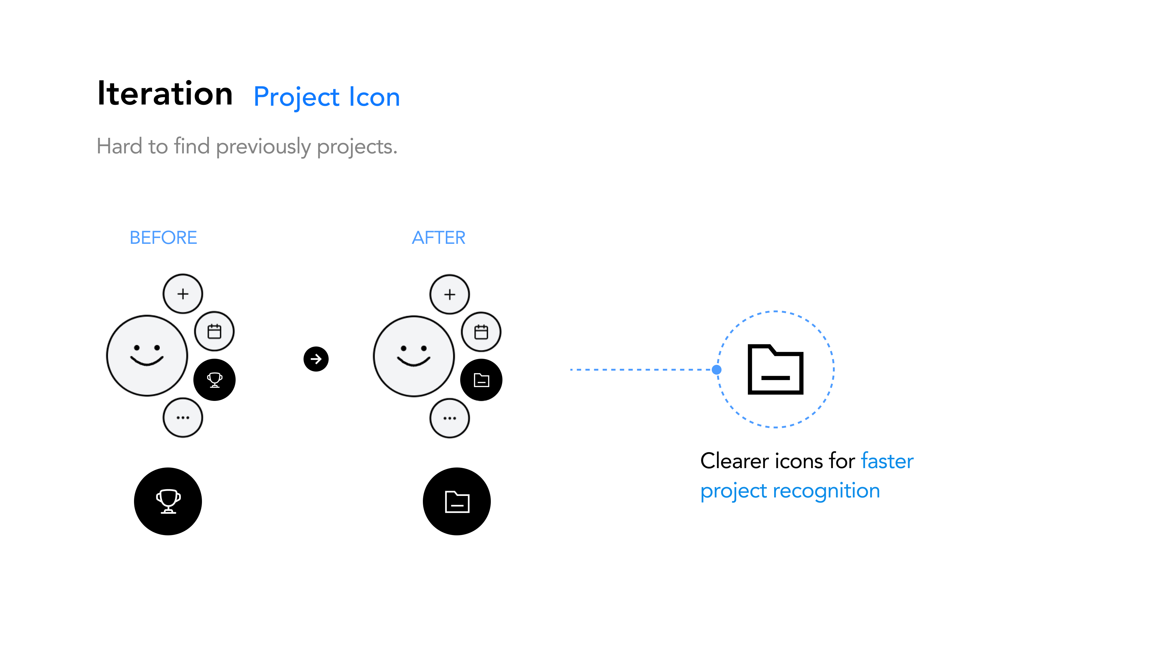
Students could not quickly distinguish previously created projects.
After
Replaced the ambiguous trophy with a folder icon, making projects faster to recognize.
Finding → change
Before
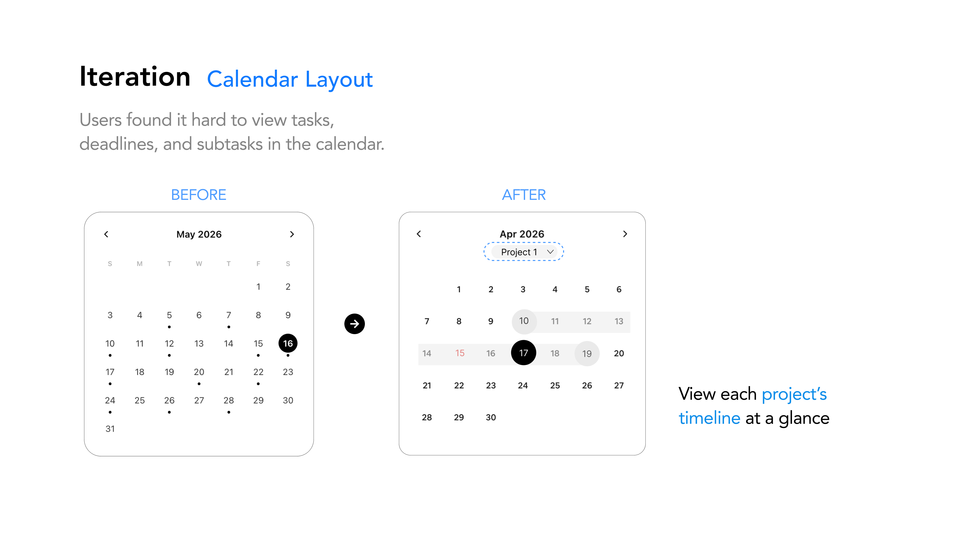
Tasks, deadlines, and subtasks were difficult to understand together in the calendar.
After
Added a project filter and visible date range so students can read each project’s timeline at a glance.
Finding → change
Before
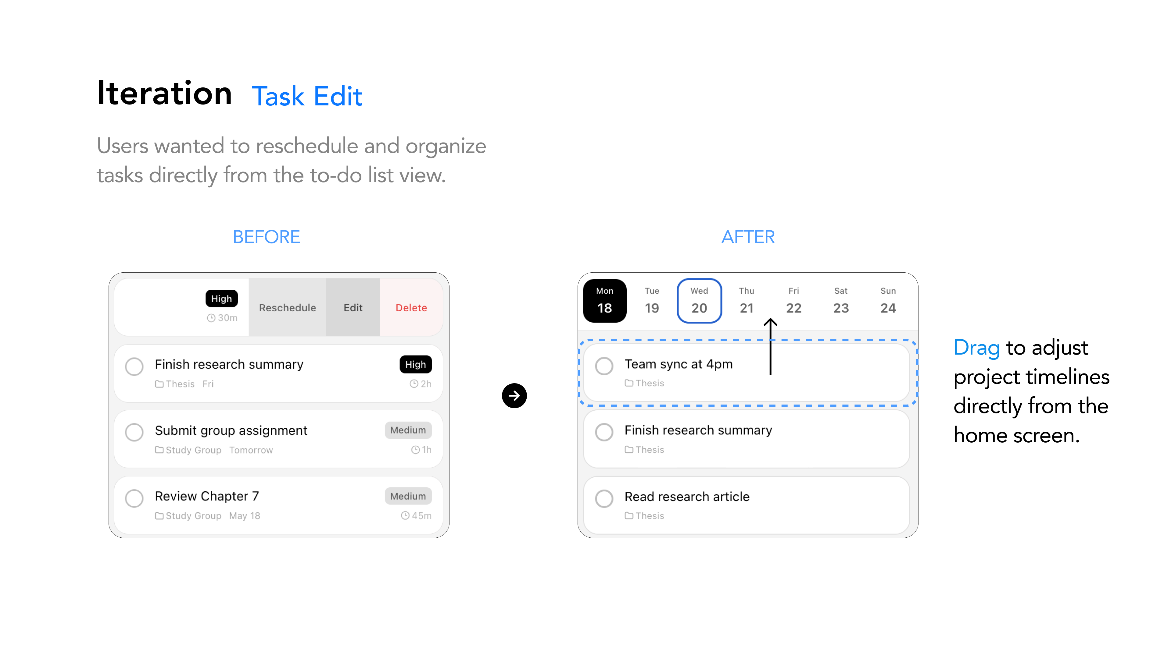
Changing a task date required opening task controls from the list.
After
Enabled direct drag-and-drop from the home screen, so students can move work to a new day in one action.
Working metric: the 90% recommendation figure is retained from the final presentation and will be updated when the original calculation is confirmed.
Reflection
Noty’s strength is its lightweight focus: quick capture and direct rescheduling offer timely support without asking students to maintain another complex system.
Does weekly feedback help students make better decisions, or add more information to process? I would test its value before assuming it belongs in the experience.
I would validate the core flow in everyday student routines earlier, then use the findings to decide what to keep, simplify, or remove—not simply what to add.